Types of Forex Charts and How to Read
-
When it comes to trading, there are a lot of different charts that can be used. This article will teach you about the different types of charts and how to use them for your trading strategy. Hopefully, this will help you make better-informed decisions when it comes to choosing which chart to use in any given situation.
Forex charts are essential to understanding the movement of the currency markets. They can show you how prices are changing over time, and help you to make informed investment decisions. In this article, we'll go over the different types of forex charts and what they can tell you.
Types of Charts used in Forex Trading
Most of the time, charts are used in technical analysis. Before you can start analysing charts, you need to know what kinds of charts can be used to predict how the market will move and how different charts are made. When you're trading forex, you'll need to be aware of the different types of charts in order to make informed decisions.
Here are three types of charts that are most often used in forex trading:
1. Line Chart
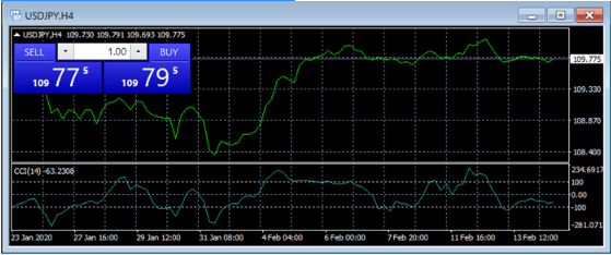
A line chart is the most fundamental and straightforward price depiction in forex. Essentially, it indicates several pricing points for a certain item on the diagram and then connects the spots with a continuous line.
Now, although line charts are relatively simple to comprehend, they are actually too simple. They solely represent the closing exchange rates of currency pairings. Therefore, the line chart would not convey complicated information such as opening or highest/lowest prices to traders.
2. Bar chart
In contrast to the line FX chart kinds, bar charts are more detailed and give even more pricing. This bar depicts the four distinct values of a currency pair over a specified time period - minutes, hours, days, or higher.
Here are these four prices: the top and bottom ends of the bar reflect the highest and lowest values of the item within the specified time period; a short vertical line on the left indicates the beginning price, while the same line on the right indicates the closing price.
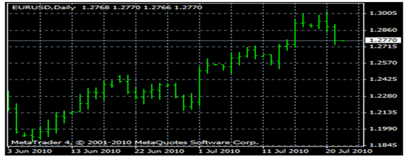
Bar charts are far more complicated than line charts for obvious reasons: whereas a line chart displays a single price, a bar chart indicates four values. But when it comes to the most intricate chart kind, even bars are insufficient.
3. Candlestick FX chart
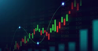
In contrast to bar charts and line charts, which only display one price over a larger time frame, candlestick charts (depending on trader preferences) display four prices over a longer time frame. Briefly, the individual bars are grouped in a certain time period and provide the opening/closing and high/low values for a currency pair.
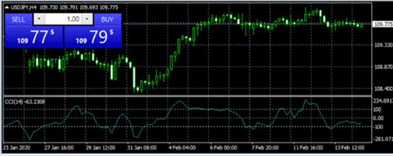
The "actual body" (the area between the open and close lines) on this chart style reveals whether or not a trader was successful. If the true body is white/green, this signifies that the opening price was lower than the closing price and the trader sold a pair at a higher price and received a payment. This indicates the trader who sold a pair at a lower price and suffered a loss had an initial price that was greater than the closing price.
How to read forex charts?
Time is plotted along the horizontal x-axis and price along the vertical y-axis on all trading charts. This indicates that when we move to the chart's left, we may observe historical prices. The displayed dates and times will vary based on the zoom level of the chart. The greater the zoom level, the more historical price movement will be seen.
The vertical y-axis in forex trading charts displays the 'exchange rate' pricing for the market being viewed. On the basis of this rudimentary understanding of price and time, we can deduce several situations that assist traders in deciding when and what to trade:
If the forex exchange market rate has declined from the left side of the chart to the right side of the chart, we can conclude that the market is in a downturn or that sellers are in charge.
If the forex exchange market rate has increased from the left side of the chart to the right side of the chart, we can conclude that the market is in an uptrend or that buyers are in charge.
This may seem elementary to some, but it is actually highly significant. Why? Because once a pattern is established, it may persist for an extended period. To determine how much a market rises or falls, we must examine exchange rate prices and determine what "pips" are.
Conclusion
There is a process known as technical analysis in trading, and here is where these charts are important. In order to draw specific inferences about the past performance of their investments, traders use price charts, as previously noted.
If you're looking to learn more about forex trading, be sure to check out our Forex academy. Here, you can find a wide variety of types of charts that will help you better understand the markets and make informed decisions. Whether you're a beginner or an experienced trader, there's likely a chart type that'll fit your needs.
Related Articles
View All >
How do Interest Rates and Inflation Affect Forex?
Big moves in the forex market don’t happen randomly, they are often driven by key economic factors like interest rates and inflation. These fo...

Best Trading Tools & Resources Every Trader Should Use
Most traders don’t rely on guesswork anymore. They try to understand how the market is moving before making a decision. To achieve this, they...

Forex Market Hours: A Complete Guide to Trading Sessions
The forex market is open 24 hours a day, five days a week, which are its market hours. Within these hours, trading is divided into four major sessio...

What is a Stop-Loss Order? How to Protect Your Trades & Manage Risk
The financial markets can be unpredictable, with prices moving up and down quickly. Even the best strategies can face unexpected changes. In trading...

Support and Resistance Levels: The Ultimate Guide for Traders
When you trade in financial markets, you start seeing patterns. Price does not move up and down randomly but tends to react at certain levels. Somet...

Fundamental vs. Technical Analysis: Know the Difference!
Every trader, whether they’re placing their very first trade or managing a seasoned portfolio, starts with the same question: “Where...

Best Forex Pairs to Trade for Beginners 2026
The first time in the forex market may be daunting. There are hundreds of combinations that form a currency, and a beginner may be at a loss as to w...
What is the 3-5-7 Rule in Trading?
Risk awareness is one of the largest challenges for any person venturing into the financial markets. Most traders do not fail because they do not kn...

Best Day Trading Platform for Beginners
Day trading is now one of the most interesting and thrilling methods of engaging in financial markets, particularly among novices who would want to...

Understanding Interest Rates in Forex Trading: A Guide for Beginners
The interest rate is one of the strongest variables that determine the price of the currency in the forex trade. Being a novice and wanting to learn...

7 Effective Forex Trading Strategies for 2025
In such a dynamic environment in the forex trading industry, a good strategy is...

Boost Your Algorithmic Trading Strategy with Forex VPS Hosting
Fast time is of the essence in the fast world of Forex trading, and more so when you are using an Algorithmic Trading Strategy to run your trades. T...

How do you create a Forex trading bot using ChatGPT?
The forex market is considered to be one of the most liquid and dynamic financial markets in the world. Traders are constantly seeking new means of...

How Economic News Affects Forex Trading?
Economic news is one of the factors that influences the exchange in the forex field. The economy-related events are carefully observed by the trader...

What is Price Action Trading in Forex?
Forex price action trading is the most respectable and time-tested trading strategy in all financial markets. Movement, candlestick patterns, and pr...

Advantages of Using the Best Regulated Brokers for Forex
In recent times, Forex trading has become an exciting way for people to access the global financial markets and benefit from currency movements to g...

The Future of Copy Trading with AI, Bots, and Next-Gen Strategies
Trading is experiencing rapid evolution from the use of new technology and newer techniques. Copy trading has been one of the leading forms of evolu...

AI in Forex Trading: The Benefits and Risks
Forex trading is a lively, fast-paced, worldwide market where technology is more and more important. Forex trading has greatly improved due to the i...

What is Latency? How Does Latency Impact Forex Trading?
Latency is one of those important considerations that are often not spoken about much in online Forex trading. It does not matter whether you are a...

How to Trade Forex Using Crypto
In this fast-evolving financial world, the coupling of crypto with traditional markets has spawned new trading avenues globally. One of the trendy a...

When is the Best Time to Trade the Forex Market?
The Forex market is a volatile global market operating around the clock for five days a week, with opportunity forever knocking on the door for any...

How to Trade Stocks with Leverage 1:5000
Stock trading has never been so simple, and traders now have time-tested methods and advanced technology to capitalize on trading profits. One of th...

Forex MT4 Robot: How to Create and Set Up
In today's fast-paced financial markets, you will find traders searching for tools that will meet their needs. Forex trading has some popular ap...

What is a Forex VPS? Benefits and How to Choose
In today’s era, speed and stability are key to making a potentially profitable trade in currencies. Virtually, a Forex VPS Hosting could be an...
What is Swing Trading in Forex?
Swing trading is an intermediate trading style, a compromise between day trading and longer-term investing. It involves holding onto positions from...

What is Spread in Forex Trading & How is it Calculated?
Forex trading is known as the largest financial market in the entire world and it is a marketplace for everyone who wants to make a potential profit...

What is Base and Quote Currency in Forex
Forex trading is a trading practice of global currencies through trading in pairs all over the world. When you engage in forex trading, you are deal...

Difference Between Copy Trading & Social Trading
In the world of online investing, copy trading, and social trading have emerged as powerful strategies, especially in the forex market. These method...

How to Manage Risk While Copy Trading?
Copy trading has become a popular method that enables traders to copy the transactions of skilled traders. For beginners, it can simplify trading an...

How to Stay Focused and Disciplined in Forex Trading?
In forex trading, there are vast opportunities for traders if they are focused and disciplined. Success in this dynamic market of changing currency...

Tips for Choosing the Right Brokerage Platform for Your Trading Needs
Investors at all levels of experience can find a lot of opportunities in the exciting world of finance. But choosing the right brokerage platform is...
What is a Currency Trading Platform?
Currency trading platforms are software systems that allow traders to participate in trading online currency. They give you a chance to view real-ti...

Exploring the Best Forex Trading Indicators
The use of indicators is crucial while forex trading. Many traders use these indicators daily to help them determine when to buy and sell in the cur...

Types of Hedges and Hedging Techniques
Hedging is like a financial strategy that financial backers should understand and use since it accompanies a lot of advantages. It acts as an invest...
Hedging in Forex Trading
Hedging is a strategic pillar of risk management in the complex world of trading, and understanding its nuances is paramount for any trader navigati...

A Guide to Starting a Hedge Fund and its Benefits
In today’s era, Hedge funds are one of the most well-known investment vehicles. They offer benefits for investors including the ability to pro...

What is Hedging? – An Ultimate Guide
The concept of hedging can be applied to a variety of investments like bonds, commodities, stocks, and currencies. Hedging typically involves the ut...
How to Trade Forex for Beginners
Welcome to the exciting world of Forex investments, where people can make a lot of money by swapping currencies all over the world. The
How to start forex trading?
Forex trading is an exciting market that offers tradable currencies the chance to react to changes quickly through a Forex trading platform. Forex i...
What is Volatility in Forex?
The term 'Volatility' in the context of forex is a measure of the fluctuation in the value of a currency pair over a specific period. It is...

Most Traded Currency Pairs in Forex Market
If we talk about currency pairs then it is imperative to say that their existence in the early 90s gave rise to an entire domain of trading. Nowaday...

Know the Difference between Forex Trading and Stock Trading
The forex trading and the stock trading, are two of the most popular markets for traders of assets. Making the right decision when choosing one of t...

All you need to know about Social Trading: Beginners Guide
Introduction: What is Social Trading? Trading is becoming more and more popular as people now turn to financial markets to provide them...

An Overview to Foreign Exchange Market
Introduction to Foreign Exchange Market The Forex Market (also known as the Forex, FX, or Currency Market) is the over-the-counter (OTC)...

5 Profitable Forex Copy Trading Tips
If you're looking for investment alternatives with low-cost and low-risk that also have a higher chance of success rates and rewards, Forex

Know the Top Strategies to Trade Forex in 2022
When it comes to trading foreign currency, it is unquestionably essential to ensure that you have identified the most successful tactics overall. Ke...

Copy Trading Guide and its Advantages and Disadvantages
Getting inspired by colleagues or an expert trader and beginning with trading cryptocurrency sounds incredible. However, it's not that easy; tra...

A Complete Guide to Understand Forex Market!
What is Forex Trading? Forex is the settlement of transactions in any one currency for delivery of another. Its settlement system is ma...

Basic Forex Trading Terminologies Every Trader Should Know?
Trading and investing can be a complicated process. There is a plethora of terms to keep up with, and you need to understand what they mean in order...

Everything You Need to Know About Currency Pairs
What is a currency pair? A currency pair enables the comparison of two distinct currencies' values. Consider the existence of two d...

How Online Financial Trading Works?
How Online Financial Trading Works? With the advent of online financial trading, investors seem to have become more interested in financ...

Best Global Online Forex Broker
The largest and the most actively traded financial market is the foreign exchange market. When it comes to trading in the foreign exchange market, t...

Tips to Understand Online Financial Trading
Tips to Understand Online Financial Trading As in now, every individual wants to invest in some financial asset. Online financial tradin...

What Is Online Financial Trading?
What Is Online Financial Trading – Know the Advantage Investment has now become a lot easier thing than it used to be in earlier t...

